


If you run a Shopify furniture store, theme optimization is your foundation for Shopify store optimization, not redesigns.
As 2025’s competition tightens, merchants face a new question: how do you make an existing store load faster, convert better, and scale smoother without rebuilding from scratch?
This article explores exactly that.
We break down the principles, real-world examples, and practical steps behind Shopify store optimization so your store stays ready for every season, every campaign, and every surge.
Optimization Is the Real Advantage.
In 2025, design alone won’t decide who wins on Shopify, performance will.
For furniture brands, every millisecond now matters: slow loads waste ad spend, clunky UX breaks trust, and missed checkouts cost real sales.
That’s why Shopify store optimization has become the new competitive edge.
It’s not about rebuilding your store, it’s about refining what already works, so it loads faster, feels smoother, and converts higher.
In this guide, we’ll show how leading furniture brands turned everyday improvements into measurable growth and how you can do the same within 90 days.
The Setup Problem Every Merchant Faces
Most Shopify merchants assume performance problems start with their theme when in reality, they start with how the store is managed.
Every new app, tracking pixel, or custom script adds friction. Every oversized image and unoptimized video adds milliseconds. Over time, what began as a clean Shopify build turns into a slow, overloaded storefront.
The result?
- Ad costs rise while page load slows.
- Shoppers bounce before products even appear.
- Marketing teams push harder, but revenue barely moves.
This is the hidden cost of neglecting Shopify store optimization.
Not the lack of creativity but the lack of structure.
The highest-performing stores don’t just look good. They’re disciplined systems: audited monthly, lightweight in code, precise in UX, and consistent in speed.
Why Store Optimization Outperforms Store Redesign
Redesigns feel dramatic, they look fresh, cost thousands, and seem like a restart.
But most of the time, they solve symptoms, not causes.
Changing the layout won’t fix slow scripts.
Switching colors won’t solve broken UX logic.
Installing a new theme won’t reduce server requests or optimize image delivery.
That’s why the smartest brands treat Shopify store optimization as a long-term system, not a one-time project.
They audit, refine, and test continuously turning small technical wins into measurable business impact.
Data across Shopify Plus brands shows a consistent pattern:
- Stores that invested in ongoing optimization saw 15–25% higher checkout conversion rates than those relying on redesigns alone.
- Page load times dropped by up to 40% without switching themes.
- Merchants maintained steady ROI during peak campaigns because their foundations were already stable.
Optimization compounds.
Every refinement strengthens the next until performance itself becomes your growth engine.
Maybe you want to read: Shopify Speed Optimization Playbook for a Profitable Store in 2025
Key Optimization Principles Every Shopify Furniture Store Should Apply
Optimization doesn’t start with a redesign, it starts with how your store behaves under pressure.
Every Shopify store runs on the same foundation, but the difference between those that grow and those that stall lies in how precisely they manage speed, structure, and trust.
These five principles define that difference.
Speed as the First Impression
For furniture brands, visuals matter but speed decides whether anyone ever sees them.
Large lifestyle photography, embedded videos, and third-party scripts often slow load times and inflate bounce rates. The first five seconds determine whether shoppers stay or leave.
How to fix it:
- Compress all images to under 200 KB using WebP format.
- Enable lazy loading for below-the-fold visuals.
- Limit homepage sliders to 2–3 slides instead of 6–8.
- Defer non-critical JavaScript (reviews, tracking scripts) so product content loads first.
Result: Faster pages reduce bounce rates by up to 30% and increase engagement across both paid and organic traffic.
Predictable Navigation and UX Flow
A clean design fails if shoppers can’t find what they need.
Many furniture stores overwhelm visitors with too many categories like “Living,” “Dining,” “Decor,” “New Arrivals,” “Sale,” “Collections.” It looks comprehensive but creates decision fatigue.
How to fix it:
- Limit top navigation to five main categories.
- Add sub-collections or filters only when needed (e.g., “Material,” “Color,” “Size”).
- Keep the cart icon and CTA positions consistent across pages.
- Use breadcrumbs so users can easily go back one step without reloading.
Result: Shoppers move through the buying process faster, and cart abandonment rates drop not because of discounts, but because navigation feels effortless.
Conversion-Centered Product Pages
Your product page is where attention becomes action.
In many Shopify furniture stores, critical information like delivery timelines, return policies, or assembly details are buried at the bottom of the page. Customers hesitate when they can’t find clear reassurance right where they decide to buy.
How to fix it:
- Place shipping info, return policy, and payment options near the “Add to Cart” button.
- Use concise feature lists instead of long descriptive paragraphs.
- Add sticky CTAs on mobile (so users never lose sight of their next step).
- Display trust badges (secure payment, warranty, free shipping) directly below the button, not in the footer.
Result: When reassurance meets visibility, conversion rates increase by 10–20%.
The more transparent you are, the less hesitation shoppers feel.
Visual Trust and Consistency
Furniture is a visual purchase.
But inconsistent photography, different lighting tones, or irregular image ratios make even great products look cheap.
Visual inconsistency doesn’t just affect aesthetics, it breaks trust subconsciously.
How to fix it:
- Standardize lighting, angle, and cropping across product photos.
- Use neutral backgrounds for main images; save lifestyle photos for storytelling sections.
- Avoid heavy animations or parallax effects that delay rendering.
- Check color accuracy, furniture buyers care about materials, finishes, and realism.
Result: A visually stable store feels premium and credible.
Consistency signals reliability and reliability converts.
Continuous QA and Monitoring
Optimization isn’t a one-time launch. It’s a rhythm. Many merchants improve speed once, celebrate results, and move on until the next promotion breaks something. Shopify updates, new apps, or changed scripts can quietly slow down performance again.
How to fix it:
- Run a performance audit every month (Core Web Vitals, Lighthouse).
- Back up your theme before editing code or installing apps.
- Track load time after every marketing campaign.
- Review analytics weekly to spot changes in conversion rate or checkout flow.
Result: Regular maintenance prevents sudden crashes or slowdowns during high-traffic events like BFCM or holiday seasons.
Real-World Inspiration – How Leading Furniture Brands Optimized Their Shopify Stores
Optimization looks different for every brand, but the logic behind success is always the same: performance, clarity, and consistency. The following furniture brands built strong digital experiences not by chasing new themes or full redesigns, but by refining what already existed: faster pages, simpler journeys, and clearer stories.
Each example below shows:
- What specific challenge the brand faced,
- Which optimization strategy they applied,
- The measurable result, and
- How you can apply the same logic to your own Shopify store.
You don’t need a new store to perform better.
You need a clearer one that responds faster, guides smarter, and earns trust with every click.
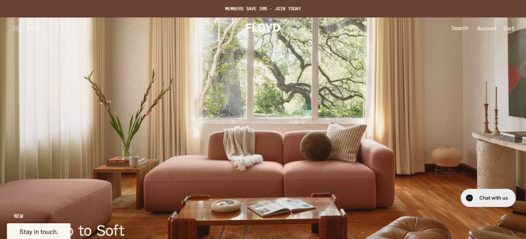
Floyd – Turning Load Speed into Brand Credibility
Focus area: store performance optimization and homepage efficiency
Floyd, a Detroit-based furniture brand known for modular design and minimalist craftsmanship, quickly rose to prominence with its clean aesthetic and modern storytelling. But as traffic surged and product videos multiplied, the storefront began to slow down. Page loads stretched beyond four seconds, and the bounce rate climbed sharply – a performance issue disguised as a design success.
Instead of investing in a complete rebuild, Floyd focused on Shopify store optimization to restore its digital agility. The team removed autoplay hero videos, replacing them with one high-quality static banner image under 200 KB. Lazy loading was implemented across all visual assets, and redundant third-party scripts were deferred to load only after user interaction. The shift from “heavy creative” to “smart performance” allowed Floyd to preserve its visual identity while dramatically improving site speed.
Results
- 40% reduction in total page weight.
- Largest Contentful Paint (LCP) improved to 2.2 seconds.
- +18% increase in add-to-cart conversions during seasonal sales.
Optimization Tip
Visual storytelling performs best when it loads instantly. A strong image above the fold can outperform a slow video carousel every time.
How You Can Apply This in Your Shopify Store
- Limit homepage hero sections to a single static banner with compressed imagery.
- Run a speed audit using Google Lighthouse or Shopify’s Analyzer before each campaign.
- Defer all non-essential tracking scripts (reviews, popups, remarketing).
- Use lazy loading for images below the fold: customers won’t notice, but your speed metrics will.
Why it works
Speed builds credibility before branding does.
A fast store subconsciously signals quality, care, and professionalism that define premium furniture brands. When every millisecond counts, performance becomes part of your brand promise.
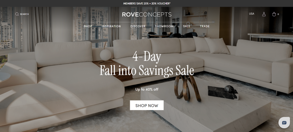
Rove Concepts – Premium Through Predictability
Focus area: UX simplicity and conversion-driven product flow
Rove Concepts is one of North America’s most recognized furniture brands, known for minimalist designs and timeless interiors. As the brand’s catalog expanded, its Shopify storefront grew complex: multiple product variants, long-scroll pages, and inconsistent CTA placements made the experience visually stunning but functionally heavy.
Instead of a full redesign, Rove focused on Shopify store optimization – simplifying without sacrificing beauty. They restructured their product pages into tighter, scroll-efficient modules, moving essential information such as materials, care details, and delivery timeframes directly below the price. Add-to-cart buttons became sticky on mobile, and image sequences were compressed for speed without losing quality.
Results
- +21% increase in add-to-cart clicks on mobile devices.
- 15% faster average page load time across top collections.
- Higher user retention, with a 12% drop in PDP exit rate.
How you can apply this to your Shopify store
- Simplify your product layout: key details (price, material, delivery info) should appear before the fold.
Use sticky CTAs on mobile, consistency improves completion rates. - Limit image galleries to 5–7 high-quality visuals; too many slow load time.
Why it works
When shoppers don’t have to search for reassurance, they buy faster.
Simplicity doesn’t limit luxury, it reveals it.
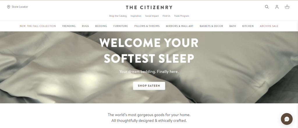
The Citizenry – Purpose Where the Wallet Decides
The Citizenry built its brand around handcrafted furniture and meaningful narratives – each product tied to artisan stories and ethical sourcing. But as their Shopify store grew richer in visuals and copy, performance quietly declined. Long-scroll product pages and heavy media content led to slower mobile loads and distracted navigation.
Instead of cutting storytelling, the brand re-engineered how it appeared. Through Shopify store optimization, The Citizenry transformed its PDPs into layered, scroll-responsive sections. They replaced autoplay lifestyle videos with compressed static imagery, added scroll-triggered fade-ins only where needed, and integrated product story highlights directly beside CTAs, ensuring emotional connection never slowed down the sale.
Results
- 25% drop in mobile bounce rate.
- 17% lift in checkout completion during peak campaigns.
- 40% faster load speed across story-driven pages.
Optimization tip
Emotion works only if experience supports it. Optimize your visuals for flow, not just beauty.
How You Can Apply This in Your Shopify Store
- Use shorter, sequential content blocks instead of long text paragraphs.
- Add clear delivery info near “Add to Cart” to replace uncertainty with confidence.
- Limit animations to one motion effect per viewport; subtle movement feels premium and loads faster.
- Run mobile-first tests; if a story feels slow on mobile, it’s losing sales.
Why It Works
Good storytelling should guide attention, not compete for it.
When emotion is delivered with efficiency, shoppers don’t just feel connected, they convert with confidence.
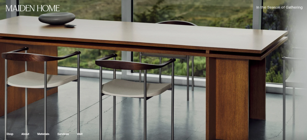
Maiden Home – Scalable Content Through Structure
Focus area: automation and product data performance
Maiden Home has redefined the modern furniture experience offering custom pieces crafted to order, made in North Carolina workshops. But with hundreds of fabric, color, and finish combinations, managing product data became increasingly complex. Launching new collections often meant manually editing dozens of PDPs, introducing errors and delaying campaigns.
To solve this, the team focused on Shopify store optimization at the structural level. They rebuilt their catalog around Shopify 2.0 metafields, allowing shared data (materials, dimensions, lead times) to populate automatically across all product pages. Seasonal updates could now be made once in a central dataset and applied instantly to every variant. Marketing teams used pre-built templates that loaded faster and followed a consistent hierarchy freeing developers from repetitive content edits.
Results:
- 70% faster product-launch workflow.
- Zero data mismatches across PDPs post-update.
- +10% engagement increase from consistent layout design.
Optimization Tip
Automation isn’t just about saving time, it keeps your store consistent and your UX predictable.
How You Can Apply This in Your Shopify Store
- Define metafields for recurring product data (e.g., material, care, shipping).
- Use Shopify 2.0 sections to standardize PDP layouts.
- Store all collection images in unified aspect ratios to prevent layout shifts.
- Create templates for seasonal launches, consistency scales better than speed alone.
Why It Works
Structure creates reliability.
When product data flows automatically, your store becomes lighter, faster, and easier to grow.
Optimization isn’t what you add, it’s what you make repeatable.
Burrow – Personalization Without Performance Loss
Focus area: dynamic content optimization and modular UX performance
Burrow built its success around modular furniture and flexible living; letting customers configure sofas, shelving, and accents to fit any space. But personalization came with a trade-off: each new option added more variant data, dynamic scripts, and interactive previews, which slowed page rendering. Shoppers loved the interactivity, but the store performance began to lag, especially on mobile.
To fix this, Burrow leaned into Shopify store optimization rather than redesign. The team restructured its product configurator to load options progressively instead of all at once, reducing initial payload by 35%. They pre-rendered the most popular variants and cached them via Shopify’s CDN, ensuring fast repeat views. Product preview images were replaced with optimized WebP sequences, cutting visual load time by half without reducing detail.
Results:
- 45% improvement in page load speed across PDPs.
- +16% increase in completed configurations.
- -18% bounce rate from mobile users.
Optimization Tip
Personalization doesn’t need to slow your store. Prioritize what loads first, not everything at once.
How You Can Apply This in Your Shopify Store
- If your store offers customizable products, preload only key variants (best sellers or default options).
- Convert large PNGs to WebP for configurators or multi-angle previews.
- Test load order with Chrome DevTools to identify blocking scripts.
- Cache dynamic assets (images, fonts, scripts) through Shopify’s CDN wherever possible.
Why It Works
Performance is the invisible part of personalization.
When your store anticipates user behavior, loading just what matters first, it feels faster, smarter, and more human.

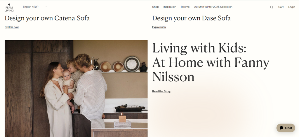
Ferm Living – Calm as a Conversion Strategy
Focus area: UX clarity and visual calmness
Ferm Living, the Copenhagen-based interior and furniture brand, has always embodied a sense of calm through its Scandinavian aesthetic. But as its Shopify store expanded globally, that calmness began to fade under the weight of promotional banners, autoplay videos, and inconsistent layouts across regional storefronts. Pages looked beautiful but they loaded slowly and felt cluttered in motion.
Instead of stripping down design entirely, Ferm Living applied Shopify store optimization to restore balance between aesthetics and usability. The team unified typography and spacing across all layouts, reduced homepage banners from six to two, and replaced video carousels with high-quality stills compressed to under 250 KB. Animations were limited to soft fades, timed only on visible sections, cutting render-blocking by nearly half.
Results
- 36% improvement in average mobile load time.
- +14% increase in add-to-cart conversions.
- -20% scroll abandonment on collection pages.
Optimization Tip
A calm experience isn’t created by adding design, it’s preserved by removing distraction.
How You Can Apply This in Your Shopify Store
- Limit your homepage banners to 2–3 key visuals with clear hierarchy.
- Align typography and spacing sitewide; consistency improves perceived quality.
- Test animations under Lighthouse Performance Audit to ensure smooth motion.
- Keep above-the-fold static whenever possible, motion below feels lighter.
Why It Works
Calmness is a conversion signal.
When visuals load cleanly and interactions feel effortless, customers interpret it as confidence and confidence sells better than chaos.
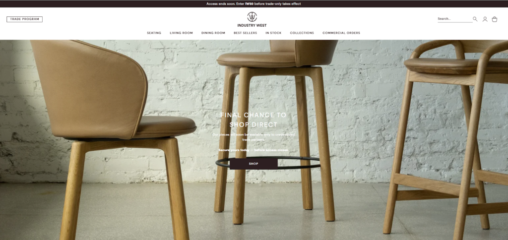
Industry West – Clarity for Complex Catalogs
Focus area: catalog structure and navigation scalability
Industry West, known for its modern-industrial furniture and B2B trade programs, faced a common scaling problem: too much catalog complexity. With hundreds of SKUs across chairs, tables, and custom projects, users often struggled to filter effectively, while load time per collection grew past four seconds.
The brand’s solution centered on Shopify store optimization through structured product data. They organized SKUs via Shopify metafields, allowing filtering by use case, finish, and availability directly within collection pages. Navigation was trimmed from twelve menu categories down to six, while large product thumbnails were replaced by consistent aspect-ratio images. This reduced both load and cognitive effort, customers could now explore faster and compare more efficiently.
Results
- 32% faster collection-page load time.
- 20% higher engagement on product filters.
- 14% growth in conversion from B2B customers during catalog updates.
Optimization Tip
Complex product lines need clarity, not decoration. Simplify how customers find what they need before you add what you want to show.
How You Can Apply This in Your Shopify Store
- Audit collection filters, merge overlapping attributes.
- Standardize product image ratios across all SKUs.
- Group related items by use (e.g., “Office Seating” instead of “Chairs”).
- Keep primary navigation under seven links.
Why It Works
A cluttered catalog drains decision energy. When shoppers understand structure, they shop longer and buy more.
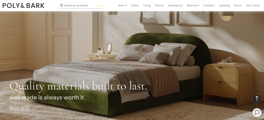
Poly & Bark – Trust Where Conversion Happens
Focus area: PDP trust placement and reassurance clarity
Poly & Bark’s strength lies in transparency: clear pricing, detailed warranty, and customer-first messaging. Yet despite that, the brand’s checkout data showed hesitation right before purchase. Customers engaged deeply with PDPs but dropped off when reassurance (returns, shipping, warranties) wasn’t visible at the decision moment.
Through Shopify store optimization, Poly & Bark restructured its PDP flow to prioritize trust cues exactly where they mattered most. They relocated warranty info, return policy, and shipping details to appear directly under the price and above the CTA. A sticky “Add to Cart” button kept these reassurance points visible throughout scrolling. The team also integrated customer reviews with verified-buyer badges near the CTA area instead of at the bottom of the page.
Results
- 19% increase in add-to-cart actions.
- 12% drop in checkout abandonment.
- 9% increase in repeat buyer rate within 60 days.
Optimization Tip
Trust should appear where hesitation begins not at the footer.
How You Can Apply This in Your Shopify Store
- Move warranty and return info next to price or CTA.
- Add trust badges (SSL, secure payment, verified reviews) within the first viewport.
- Use sticky CTAs on mobile to maintain confidence throughout scroll.
- Highlight shipping transparency (cost, speed) early as uncertainty kills impulse.
Why It Works
Furniture is a considered purchase. When trust is positioned at the point of action, confidence becomes conversion.
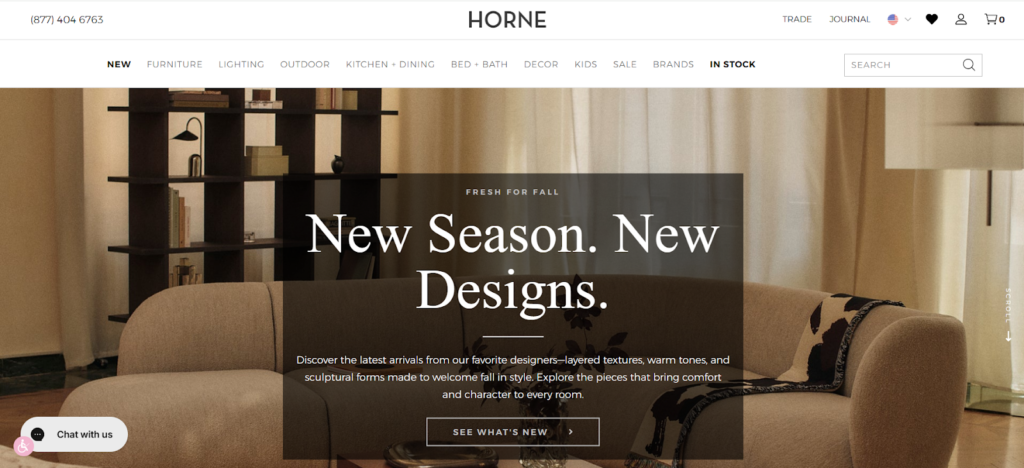
Horne – Rhythm, Not Noise
Focus area: layout consistency and visual pacing
Horne curates high-end furniture and home décor that emphasizes quiet sophistication. But while its products spoke refinement, its store design became increasingly inconsistent over time: varying image sizes, mixed typography, and overuse of animations made the brand appear less cohesive and, surprisingly, slower to shoppers.
By focusing on Shopify store optimization, Horne rebuilt rhythm into its layout. The team standardized grid spacing, unified font hierarchy, and limited animation to gentle fades. Product images were resized to a uniform aspect ratio, improving visual rhythm and cutting cumulative layout shift by 45%.
Results
- 22% improvement in average time on site.
- 15% lift in conversion from mobile visitors.
- -28% bounce rate across PDPs.
Optimization Tip
Consistency is the new luxury. Uniform design rhythm makes stores feel intentional and intention converts.
How You Can Apply This in Your Shopify Store:
- Unify all image dimensions before upload.
- Limit animation to one consistent motion style across the store.
- Align typography hierarchy (headings, body, CTA font weights).
- Review visual flow monthly, your eyes catch what analytics can’t.
Why It Works:
Luxury is clarity disguised as calm. When layout flows predictably, users feel in control and that’s when trust, and conversion, peak.
Key Takeaways — What the Best Shopify Furniture Stores Get Right
Across every brand, the same principle holds true; not in design, but in discipline. Speed wins attention. Clarity earns trust. Consistency keeps customers coming back.
The best-performing Shopify furniture stores don’t rely on new templates or flashy redesigns. They focus on Shopify store optimization: refining structure, reducing friction, and maintaining precision across every campaign.
What connects them all is a single mindset: Performance isn’t bought. It’s built.
| Focus Area | What It Achieves | Brand Example |
| Speed & Stability | Faster LCP, smoother checkout, and instant trust. | Floyd |
| UX Predictability | Fewer clicks to convert and higher mobile engagement. | Rove Concepts |
| Trust Visibility | Confidence reinforced near CTAs and checkout. | Poly & Bark |
| Storytelling Rhythm | Emotional connection without sacrificing speed. | The Citizenry |
| Modularity & Structure | Faster updates, fewer data errors, scalable growth. | Maiden Home |
Technical Deep Dive – How to Optimize Your Shopify Store for Peak Season
The best-performing Shopify furniture stores don’t just look optimized, they operate that way.
After learning from leading brands, it’s time to turn those insights into action.
Here’s a practical breakdown of how to apply Shopify store optimization across five critical layers: performance, user flow, trust, localization, and governance.
Start with Performance
Speed is the foundation of every conversion.
No matter how stunning your visuals or persuasive your copy, a store that takes longer than three seconds to load already loses 40% of potential customers.
Action checklist:
- Audit Core Web Vitals monthly using Google Lighthouse or PageSpeed Insights.
- Compress all hero images to <200 KB and convert to WebP format.
- Minimize render-blocking JavaScript, defer analytics and third-party scripts.
- Enable lazy loading for below-the-fold content.
- Use Shopify’s CDN and caching features to deliver assets from the nearest server.
Merchant insight:
Every second you save earns back both ad spend and trust. A faster store doesn’t just convert, it keeps customers coming back.
Refine the User Experience Flow
Smooth navigation reduces hesitation and decision fatigue.
Your UX flow should guide visitors intuitively from discovery to checkout with zero friction in between.
Action checklist:
- Keep top-level navigation under 7 items.
- Ensure your CTA buttons (“Add to Cart,” “Checkout”) are consistent in color and position.
- Simplify product-page layout: essential info (price, delivery, returns) above the fold.
- Add breadcrumbs and sticky navigation for seamless movement.
- Test every action on mobile: 70% of furniture traffic happens there.
Merchant insight:
Good UX isn’t about surprise. It’s about predictability that builds comfort that drives action.
Build Trust Into the Layout
Trust isn’t built in your About page; it’s built at the moment of purchase.
Furniture shoppers need reassurance: shipping clarity, return confidence, and brand transparency right beside their buying decision.
Action checklist:
- Place trust badges (secure payment, warranty, free returns) directly below CTAs.
- Display estimated delivery times on PDPs and carts.
- Add customer review snippets in the first viewport, not buried below.
- Highlight clear return or assembly policies near price details.
- For luxury products, mention “handcrafted,” “sustainably sourced,” or “limited stock” to reinforce credibility.
Merchant insight:
The most convincing copy isn’t emotional, it’s transparent.
Optimize for Cross-Border Scale
If you plan to expand internationally, optimization must start before your first export. Cross-border readiness isn’t just language; it’s performance, pricing, and compliance at scale.
Action checklist:
- Activate Shopify Markets to manage multiple currencies and regions.
- Translate key metafields (materials, dimensions, shipping) into local languages.
- Localize payment method: wallets, regional gateways, and tax display.
- Use dynamic shipping zones to show accurate rates per country.
- Monitor page speed from different regions using GTmetrix global testing.
Merchant insight:
Global growth doesn’t break stores unoptimized stores do.
Maintain Governance and Consistency
Optimization isn’t a one-time project.
As your store evolves new products, new scripts, new campaigns; performance must be maintained through disciplined governance.
Action checklist:
- Back up your store weekly before code or app changes.
- Keep a changelog for theme updates and marketing installs.
- Schedule quarterly performance reviews between marketing and dev teams.
- Track broken links, 404 pages, and redirect loops regularly.
- Document internal naming conventions for metafields and product tags.
Merchant insight
A well-governed store is the quietest sign of professionalism.Consistency behind the scenes creates reliability on the surface.
Key Takeaway:
Shopify store optimization isn’t about complexity, it’s about clarity.
Speed, structure, and trust all serve the same goal: making it effortless for the shopper to buy with confidence.
30/60/90-Day Shopify Store Optimization Roadmap
Optimizing your Shopify store isn’t a one-time project; it’s a disciplined, staged process. This 90-day plan helps you build momentum in three phases: clean, refine, and scale. Each stage compounds the last, creating long-term performance gains that drive measurable revenue impact.
Days 1–30: Audit and Clean
Objective: Lay the groundwork for speed and clarity by removing friction and unnecessary weight from your store.
Key Actions:
- Run a full performance audit using Google Lighthouse or Shopify’s Analyzer to benchmark your current Core Web Vitals.
Remove unused apps, scripts, and outdated tracking pixels. - Compress all media assets and standardize file naming (so future uploads stay clean).
- Review your homepage structure:one clear hero section, focused CTAs, no autoplay videos.
- Map your product data: confirm metafields and tags are consistent across SKUs.
Expected Outcomes
- 20–30% faster load speed.
- Leaner store architecture with lower app conflicts.
- Clearer visibility into where performance issues originate.
Merchant Insight:
Optimization starts by removing noise, not adding features.
Days 31–60: Refine Experience and Conversion Flow
Objective: Rebuild your store’s flow around how shoppers actually move with simplifying navigation, strengthening CTAs, and building trust within product pages.
Key Actions:
- Redesign PDP hierarchy: place price, delivery, and warranty above the fold.
- Simplify navigation to 5–7 primary menu items.
- Add sticky “Add to Cart” buttons and dynamic shipping bars on mobile.
- Display review snippets and assurance badges near CTAs.
Test checkout flow: reduce unnecessary fields, enable Shop Pay, and activate autofill.
Expected Outcomes
- 10–15% increase in add-to-cart and checkout completion.
- Lower bounce rate from high-traffic landing pages.
- Improved first-purchase confidence through visible trust cues.
Merchant Insight:
Every click you remove adds speed and speed creates certainty.
Days 61–90: Scale, Story, and Sustain
Objective: Turn performance into a system. Automate, document, and prepare your store for peak-season traffic.
Key Actions
- Build reusable page templates and content blocks with Shopify 2.0 sections.
- Automate recurring PDP data (materials, sizing, care) with metafields/metaobjects.
- Set up global monitoring: use Shopify Markets to localize currency, shipping, and language for top export regions.
- Schedule monthly QA sessions between marketing and dev teams.
- Create a changelog and backup rhythm before every campaign.
Expected Outcomes
- Consistent speed and UX across all pages.
- 50–70% faster launch cycle for new campaigns.
- Predictable scalability for seasonal surges.
Merchant Insight:
Optimization isn’t the finish line, it’s the habit that keeps your store performing like new.
How to Use This Roadmap
Treat this roadmap as a recurring loop, not a timeline that ends.
At the end of 90 days, restart from the audit phase with updated benchmarks.
The most resilient Shopify stores treat optimization as a business function: reviewed, measured, and improved like any other growth metric.
Final Thoughts
Optimization is never glamorous. It doesn’t happen in big redesigns or viral campaigns; it happens quietly, inside your Shopify admin, through small, deliberate improvements that compound over time.
Every compressed image, every simplified layout, every second shaved off load time adds up to a store that feels sharper, faster, and more trustworthy. That’s what Shopify store optimization truly delivers not just better metrics, but better experiences.
The brands that win peak season aren’t the ones that launch the most campaigns.
They’re the ones that stay optimized consistently, predictably, and intentionally. Because optimization is not about perfection. It’s about momentum, the kind that builds quietly until it becomes impossible to ignore.
If you’ve read this far, you already understand that optimization isn’t just maintenance, it’s growth in disguise.
At Wgentech, we partner with brands that see Shopify not as a platform, but as an evolving system that should perform as seamlessly as the products it represents.
Whether you need a store audit, a speed refinement, or a complete performance strategy, our team can help you turn everyday improvements into measurable results. The fastest store isn’t the one with the most updates, it’s the one that never stops improving. Let’s optimize it, together.